It’s been a good couple of years or so since I summed up themes for writers, and since I’m still a writer, I think it’s time to do it again. If you’re a writer, a publisher, or just someone with an idea for an online magazine, these themes could help make your site look a little more like ink on page.
Left Binding
For a long time, a lot of webpages had sidebars for menu control, as for a long time, that’s where design was. You’d put your name there, your website name and logo, maybe a menu structure, and possibly a tag cloud, and this means anyone visiting your site always had an easy-to-find structure for working out how to traverse your website.
These days, though, things are a little different. The side isn’t the only place that makes sense for a menu, with the top a fantastic location, too, and some neat web tricks able to hide menu items or have them pop down from other spots.
Hell, you might not even want anything in the side. You just might want the side there for comfort reasons, because, well, a side strip that looks a little like a margin makes the layout look more like a book or a magazine.
Some web designers agree with this, and you’ll find a small selection of themes matching this style. We’ve looked long and far, and if you’re interested in a style that incorporates a left binding — like a magazine — these are it.
Oxford
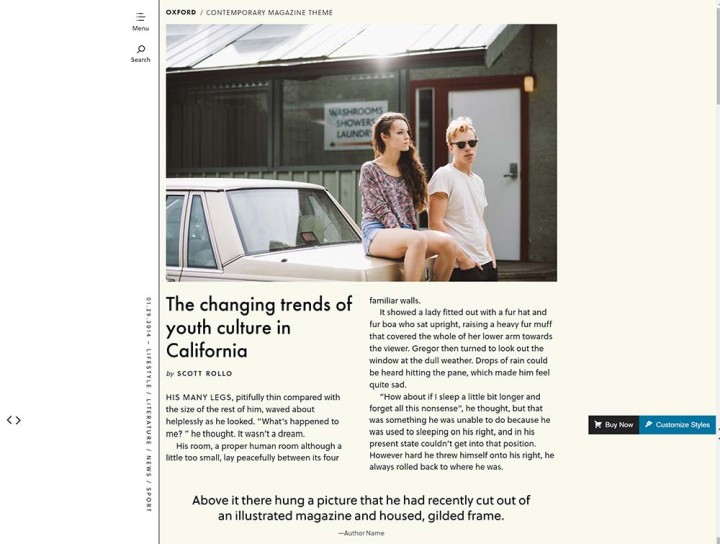
Price: $79 USD
The Theme Foundry’s take on themes made around a left binding element is simply exquisite, delivering that obvious amount of white space a left bind gets you in a book or magazine, but in a way that makes sense and looks positively brilliant on a webpage and in a web browser.
I wish I had something to make with this theme. It’s a stunner, and ideal for anyone keen on making a glossy online that looks and feels like a magazine, especially since it renders that way on a tablet, too.
Harper
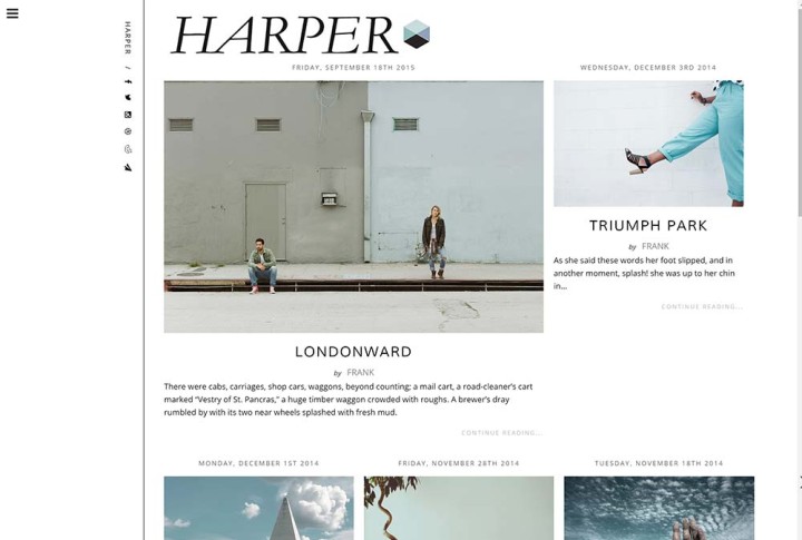
Price: $54 USD
Very similar to Oxford above, Medium and Message’s theme of “Harper” takes that same love for left binding and applies it to something that ends up looking a little more fashion-y, with the title on the binding now even sitting along the vertical.
Does this make Harper feel more like a magazine than the other?
Probably not, as it’s just different, because while Oxford feels like a mag for all sorts of publications, Harper seems focused on old-style lifestyle and fashion. Still pretty, though, even if its tiles and image placements don’t quite feel as well defined as Oxford.
Writer
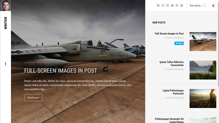
Price: €39 (EUR)
Left-binding-ish, this one grabs the binding concept and basically applies it to both a masonry style and your standard blog style, in case you couldn’t work out which of the web design styles you preferred most.
I can see what Gavick is going for in this theme, and this theme house has produced some pretty solid themes over the years, so while I haven’t played with “Writer”, have expectations that it will have some good code behind it, too.
Koi
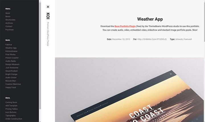
Price: $49 USD
Less about news and more about portfolios, Koi takes the masonry and left-binding style of Gavick’s theme above and makes the theme about showing your work off.
In a way, this is a theme that feels more like what would happen if you got your insane amount of work bound for showing at a job interview. Just make sure you have a lot of work, though, because without it, this one is going to look a little barren.
Rain

Price: $49 USD
What started out as a concept for the Java-based CMS Ghost became a WordPress theme not long after, and we can see why: Rain is gorgeous.
You know the serenity you feel when it’s a little cold outside, and the moisture can be felt in the air, on your tongue as you wake up, and you wander to the window and just know as drops fall from the sky onto the ground nearby, you separated by wood, brick, and a window, but the pitter-patter still present? You know how on those days you just want to stay home, curl up, and read, write, or watch some Netflix?
Rain is a theme that evokes those images, feelings, and overall mood.
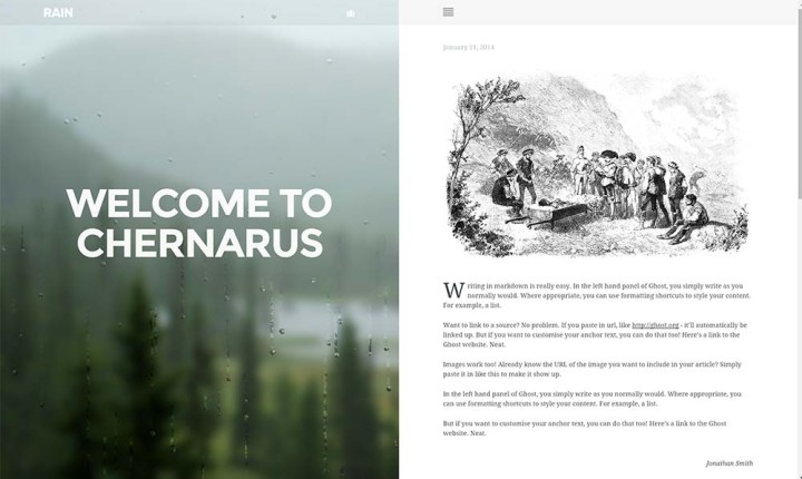
Left bound, there’s a section of this theme that won’t change, with an image you can setup and a piece of JavaScript that makes little droplets appear and slide down the glass of the webpage, you’ll get the feeling that it’s always raining on your webpage, and there’s even a bit of sound you can switch on if need be.
This is the perfect theme for writers going for a certain mood: somber, chilled, relaxed.
Dixie
Price: $44 USD
One of the first left-bound WordPress themes that suggested there might be a better use for that left side than just a contents bar, Dixie is a magazine-style theme with a view to making the left side about image focusing.
Think of the left side as a feature image that travels with you in this theme, because that’s what it is, with jump points able to transition to a new image.
It’s like being told you have control of what images the reader is looking at, forcing their eye into a specific place, which you can’t always do with magazines or text on a page.
Pixie
Price: $59 USD
Moving on from Dixie above, Pixie feels like the final result of all the hard work put into Dixie.
Made by the same developer, this theme is still about that left image being the pivotal focus point, but with more control for when it changes.
Do you want a different image visible when you scroll from article preview to article preview on the front page? This will do that, while providing a top menu bar more like a webpage and less like a magazine.
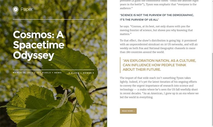
Paper
Price: $39 USD
And again, that left side becomes the focus point for an image, but don’t let Paper fool you, this theme is all about text. Specifically, this theme is about showcasing your text and using the left side to highlight a basic background image with your headline across it.
Navigation on this theme is also a little different, because while there is a menu on the right side to jump through the various categories, the emphasis with Paper is for readers to travel from article to article by going backwards, looking at older articles by flicking backwards.
Make no mistake, though, the focus in Paper is on text, with the left binding image just being used to keep you anchored.
Medium
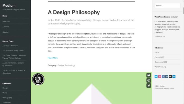
Price: $49 USD
Made of three sections, this is a theme that will deliver a left edge of a menu, a middle section filled with featured content, and a sidebar.
While this isn’t a massive glossy looking theme, what needs to be said about Medium — and it’s not made by people working on the “Medium.com” website — is that the left-and right-most bars remain fixed while the middle is what scrolls. In a way, it’s like having your story always framed.
Editor
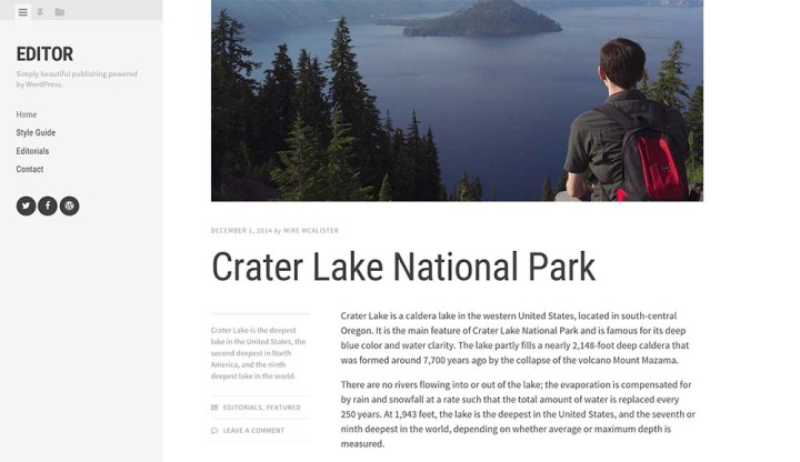
Price: Free
Essentially the free version of Array’s “Medium” from above, this Editor cuts out the right sidebar and only offers a two strip solution, with a left bar that stays in the place divided by tabs that change the bar quickly and easily without a page refresh, while the main content sits in the rest of the page to the right side.
Despite this simplicity, Editor is still a nice and clean theme, and given that it’s free, is hard to pass up.
Full Gloss
You don’t necessarily need to have a website that looks like it was bound on the left side, with a margin taken up by the artifice of digital staples and glue.
In fact, if you like the idea of a magazine website but prefer it to look like that massive glossy art mag that you always used to buy from the newsagent when they were a thing, you can have that too.
Forget the binding, this part of our list is about full gloss, and the long form you can apply to articles that you can get out of this style.
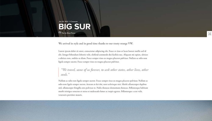
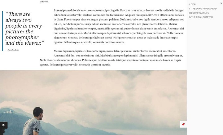
Ink
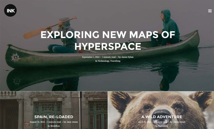
Price: $44 USD
Offering the feeling of a magazine complete with that logo sitting above the first story, Ink is about large stories, and writing in longform. If you do a lot of that, Ink could be the place where you put down your words.
Hey, Ink will even tell your readers how much time they’ll spend reading your articles, working out the rough time it takes to read by seeing how much you’re writing. Neato.
Blink
Price: $55 USD
Developed by the same team responsible for Ink above — Codestag — Blink feels like the perfection of Ink, borrowing that magazine focused glossy design and applying it to a web banner, which in turn makes the design feel a little more web savvy.
The reading time estimation is gone — probably a good thing given that could throw people off — while the articles themselves now deliver a cleaner flow to the way you read.
JRNY
Price: $44 USD
Pretty much built with big images, JRNY implies that it should be made for use with stories about a journey, and given you’ll be emphasising that with pictures, that’s kind of the message.
Just like the Codestag themes above (Ink and Blink), the stories you post will be seen as big cover images first, almost as if you had flicked open a magazine to this point, reading the story below.
If you have big images to share, JRNY may well be worth a look.
Patch
![]()
Price: $125 USD
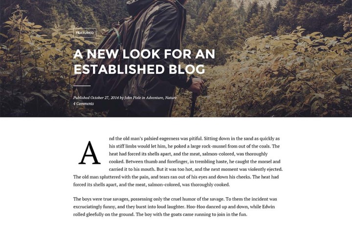
Easily one of the more expensive themes on this list — and indeed one of the more pricey themes this writer and developer has seen — Patch offers a different take on the full glossy concept, applying what its developer sees as a more newspaper approach.
The front page starts that off with a unique placement of copy and images where it almost feels like each story overlaps each other, competing for importance and position, but when you click into an article, there’s a clean layout with large pictures and even a bit of style to the way the text can be presented.
While the articles are easily read, the page that’ll draw attention is the front page, which is hard to ignore. Certainly, this is a theme to consider if you’re after a site that doesn’t really look like anything else.
![]()
Aesop + Full Gloss
Big glossy websites are great, but for those keen to have more stylistic control of the text they throw on the page, they’re going to either need skills or some special sauce.
If you have the skills to code in specialty designs and “waterfall” styles of magazine flows like the Medium website tends to rely on, you don’t need to worry about these being included as features.
Most people, though, kind of want the theme they buy to offer this sort of functionality without needing to learn a new language, or even improve on their skills considerably to get the same point across.
The Aesop Story Engine is a neat way to get around this problem, and provides a plugin to help you make the most out of long-form articles by throwing in design elements that sort of bring the feeling of a magazine article to a website.
This isn’t just text on a page; this is text on a page with a bunch of well placed images set across the width of every browser that comes across it, and potentially a video, and potentially a soundtrack, and a pull quote or two, and a map, and so on and so on.
In essence, Aesop allows a website with a focus on long writing to be more than just long writing, with the idea being that you’re letting someone see the full and complete story in a dynamic way, rather than merely reading thousands of words on a page and getting lost on the way through.
Need it translated more simply? Aesop is the evolution of longform article placement.
There is a catch, though: while Aesop doesn’t necessarily need a theme to be properly designed to work with its plugin, and you can quickly bring in the code needed to make a theme work, WordPress themes that have been designed with Aesop in mind do end up working with Aesop a little better than those that weren’t.
Fortunately, we’ve found a few glossy mag-style themes that have been made with Aesop in mind.
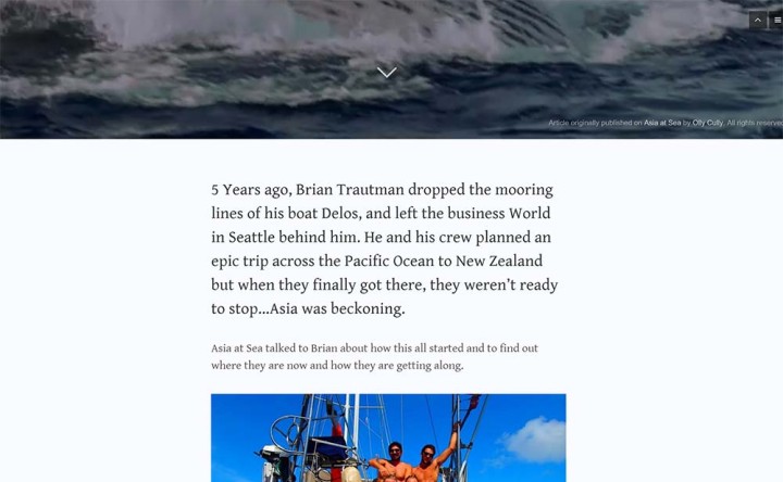
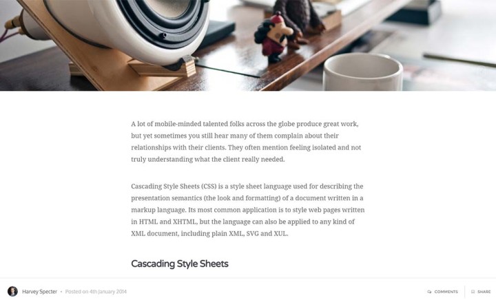
Literatum
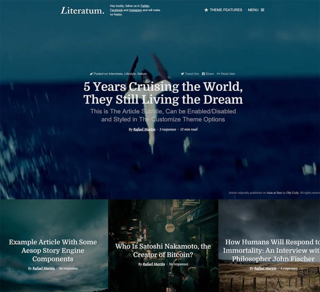
Price: $44 USD
It’s hard to express just how much Literatum speaks to me, as it feels like one of the best interpretations of a Medium-styled website mixed with the full glossy images one might find in a magazine.
Design-wise, there isn’t much going on for the theme, and really that screams to me too, with less emphasis on page design and more on the biggest images and the most subtle background videos a front cover could ever offer, which you can’t get going in a magazine.
Curious how long you’ll be reading a story for? That’s there, too, with the word count translated into a “minute read” addition, which informs the reader how long they’ll be there for.
In a way, Literatum feels like the extension and future of how a magazine would be seen online, asking you to pay attention to what’s on the page, not the total page design.
And hey, it’s awesome that the cover for each article just happens to resize to each browser you’re viewing it on, while the support for the Aesop plugin encourages those who may not be totally web savvy to build a slightly more complicated and less passive layout more like they would in print. Cool.
Myth
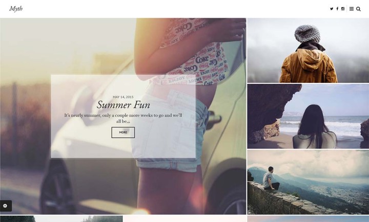
Price: $49 USD
Another Aesop-compatible theme I think is worth checking out, Myth is elegant in its simplicity, adopting a design focused on large images similar to Literatum, but drawing you back into a style that is less about what is happening solely at the centre, with a little more width, too.
Something that is fantastic to see here is Aesop’s chapter design, which sits in a tag sidebar the viewer can pop in and out with ease.
Personally, if I were to use this theme, I’d be switching out the emphasis on serif fonts for something a little more modern and cleaner, but even if left the same, there’s a lovely elegance left in this template.
Worth checking out if you’re planning on starting a mag and don’t have the money (or inclination) to print the thing.
Mostly Text
What if you’re a writer who specialises in text above all?
Forget about the images, the maps, the movies, the interactivity and sound and hogwash that makes the printed page come alive; what if you merely want to accentuate the text and get people to be immersed in the words you speak by typing each phrase, letter by letter, on the screen?
Cedar
Price: $49 USD
Starting the trend off for themes that drive character more than visual identity, Cedar offers up a large cover image to start your stories with, but then fades back as you drag the page down and scroll to see the important stuff, the text.
Even the front page scales back the images, with the headlines and description going front and centre in this theme.
Zero
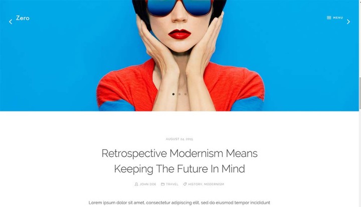
Price: $49 USD
Despite the obvious massive image you’ll see when you check out the Zero theme, I can’t shake the feeling that this one is more about text. In fact, it’s more than just about text: it’s about never leaving the front page.
When you’re there, you’ll see a big image and the headline, and if you click on the latter (because you can’t click on the former, the big image), you’ll see the text open up in that very spot, almost as if Zero was more like an app than a webpage.
You get that feeling a fair bit with Zero, actually, from the way the page moves from page to page and from category to category all the while a loading animation flicks through images behind a cutout of the logo, and while there are big images on everything, the emphasis on clear text sitting atop a white background still makes this one feel like it’s really about text.
Moka
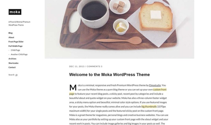
Price: €12 (EUR)
Themes from Elma Studio tend to have a bit of a sparse look to them, with obvious padding around text and a clear emphasis on white space, and Moka is no different, with a basic left sidebar for a menu always present and some clear black sans-serif text on the right.
It’s always clear, always easy to read, and sometimes quite large, just like the occasional image accompanying it.
I’ve bought themes from Elma before and have always found the code to be quite slick and easy to load, and while I don’t have a use for this theme, suspect a writer looking for cleanliness would find this most suitable.
Tinos
Price: $39 USD (starting price)
One of the more interesting themes to end on, Tinos reminds me of one of those magazines you thumbed through as a kid trying to work out what the big deal was. It’s the Economist, or Time, or another magazine that preferred to show off the work of the writer by highlighting the quality of text they could write, rather than balancing image and text the way one feels they must in other styles of magazines.
As such, Tinos feels important, because the image amounts are small, and the importance is placed on the text, and not just on the quantity of text, but how it’s placed, with columns brought into the picture even on the home page, because the way the preview is defined should tell the viewer what they’re getting into before hand.
Leave a Reply