As a writer, I have this obsession with text and letters and sentences and words.
This happens possible because I do this whole writing thing day in – at work, where I write technology journalism at GadgetGuy.com.au – and day out – when I go home and write books and other pieces of nonsense that spill out of my head and onto the page.
This obsession with writing makes me want to have a webpage that speaks more in words than playful designs, so much that the big words become the playful designs.
A few years ago, I attempted this style with what is my current WordPress theme, a modification and severe customisation that I later called “Spontaneous Box.” This theme relies heavily on Ozh’s Random Words, a plugin that pulls various lines out of a file and shows them on specific parts of the page.
To date, there are well over 50 in the system, and I want this to still be a feature in my new site, in a redesign of my page.
In fact, an upcoming redesign is exactly why I’ve written this, to show some of the themes out there that point speak in text and showcase big shiny words that yell loud and clear to the reader.
So here we are, reader, with a list that might be helpful to you. If you’re a writer that wants a WordPress theme that says “hell yes, I’m a writer,” this list is for you.
Kula
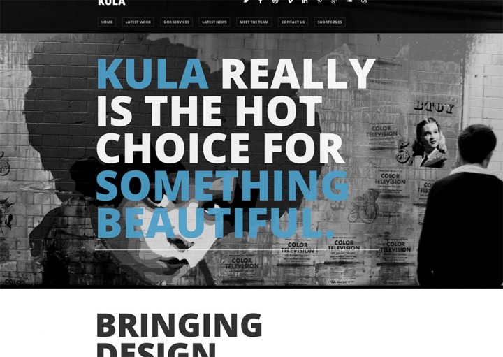
Do the words “BIG TEXT COMING OFF THE SCREEN” really strike a chord with you?
That seems to be the idea in Kula, a one page parallax theme that makes it feel like you’re reading a loud magazine screaming words in your face.
Websites based off single pages aren’t for everyone, and I wouldn’t be using this personally, but if you don’t need much more than a quick explanation of whatever it is you do, and LOVE BIG WORDS, I’d be taking this one for a quick demo.
Link: $35 on ThemeForest
Raiden
If I ran a blog, this would be a theme I would totally use. The header fonts are big, easy to read, and the images scream “click me” all over them.
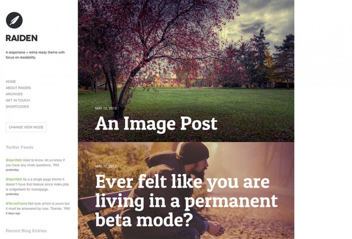
Raiden is one of those lovely themes that makes you feel as if you’re wandering through someone’s life, with positively huge sans-serif title, big intros, and easy-on-the-eyes serif paragraphs. It’s almost like you’re being led in from the loud introduction into a softened conversation, and I love it.
It supports Twitter, comes with two specific CSS types for a night or a day look (dark or light, essentially), is responsive, and has a nice smattering of shortcodes.
In fact, about the only thing that bugs me is that the page orients all the way to the left, which isn’t a look I’m especially keen of. Outside of this, it’s an awesome theme.
Link: $40 on ThemeForest
Punch
Clean, simple, and really direct. That’s the feeling I get from this one, with a page design that talks solely in minimalism.
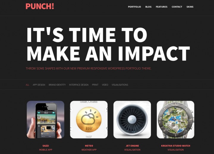
The demo page yells “It’s time to make an impact” all in caps at you, and if you’re looking for a portfolio that doesn’t go on and on over-designing it, this is probably the one.
Simplicity is the name of the game here, with either a dark or light look, colour changes, and the ability to make your portfolio image links work with whatever mask you want.
Link: $40 on ThemeForest
Blogger
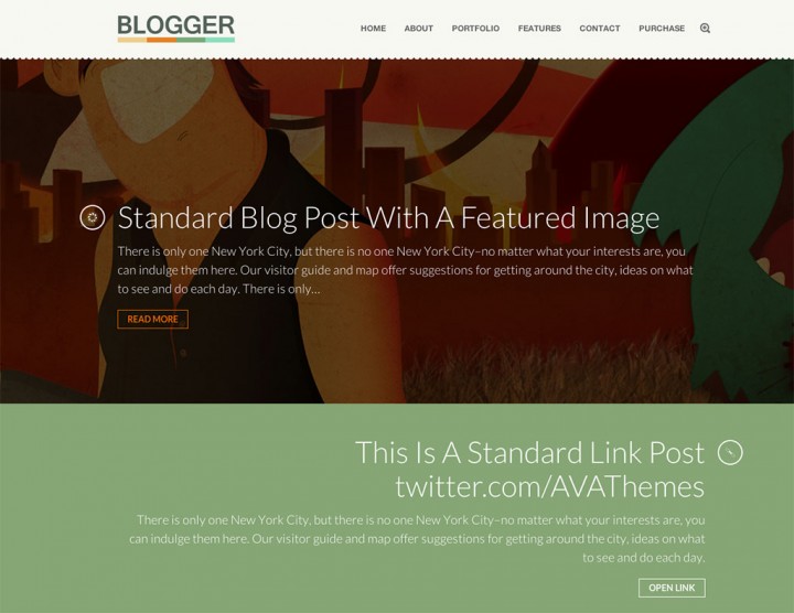
This is a theme for bloggers who really want a colourful page with an emphasis on the titles and works they’re crafting. The headers are massive, and even the intro text is big enough for anyone to read, and really, the page just comes together.
It’s also responsive and one of the clearest dynamic and colourful blog themes I’ve seen yet, and is therefore worth taking a look at.
Link: $40 on ThemeForest
Wentasi
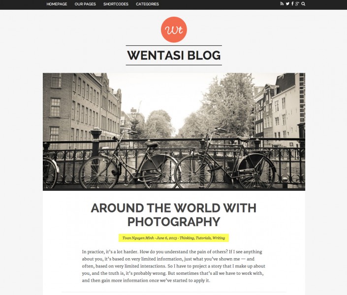
Another theme for bloggers, this one with a very Tumblr inspired design. The text is reasonably large and all in uppercase, and the images are big too.
What’s nice about this little responsive theme is the massive “Read more” buttons which are impossible to miss, and make it plainly obvious for where your readers need to click.
Link: $49 on MojoThemes
Cluster
A theme I want to buy, but haven’t decided if it’s for me yet.
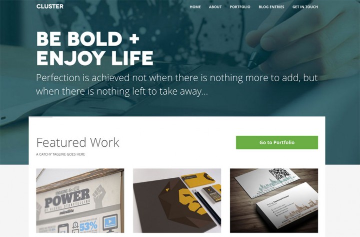
Cluster features a small text-based logo, and then a big eye-catching title that’s impossible to miss. Add to this the type of images the page supports, and we’re not talking minimalist, but we are speaking volumes in this dynamic look I can see working for creative and companies.
The theme also supports themes, ever headers, is responsive, and just looks freakin’ phenomenal.
Seriously, I’d buy this theme, but I buy too many themes as it is. That’s a terrible reason. Fine, I’ll buy it as soon as I have a good reason to.
Link: $40 on ThemeForest
Oita
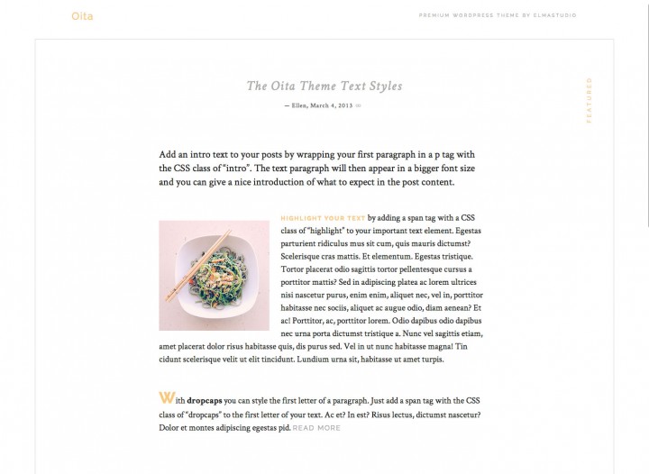
Designed by one of my favourite theme studios, Oita is a theme that reminds me of a book.
The interface is clean, and like staring at a page with nothing but the subject and text. You can pull menus and sidebars on the side, and there’s this feel of interactivity coursing through the total design.
It’s just such a lovely thing to look at, and if I was writing a page that I wanted people to view like a novel, I’d probably go with this theme, or the one I’m looking at next.
Link: €12 on ElmaStudio
Clutterless
Perhaps you don’t want to spend anything, and you still want something clean and simple that still feels like a book.
For you, there’s Clutterless, a decidedly minimal theme which look specifically at your content, which may or may not be mostly text, and showcases that.
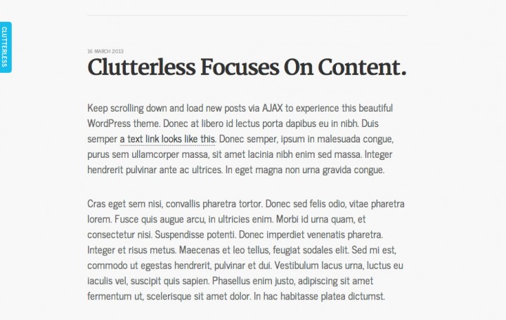
The serif titles lead your eye to the sans-serif body, and it’s not a bad combination, but what I like is the sidebar, which almost resembles a clothing tag or bookmark on the side, and when hovered over, reveals itself in a swiping animation to show your name, bio, picture, and other little tidbits.
It’s responsive, clean, and did I mention that part about it being free? I’m pretty sure I did. It’s free.
Link: Free on OnePageLove
Less
Then there’s Less, a theme which focuses on a small amount of content displayed literally in black and white.
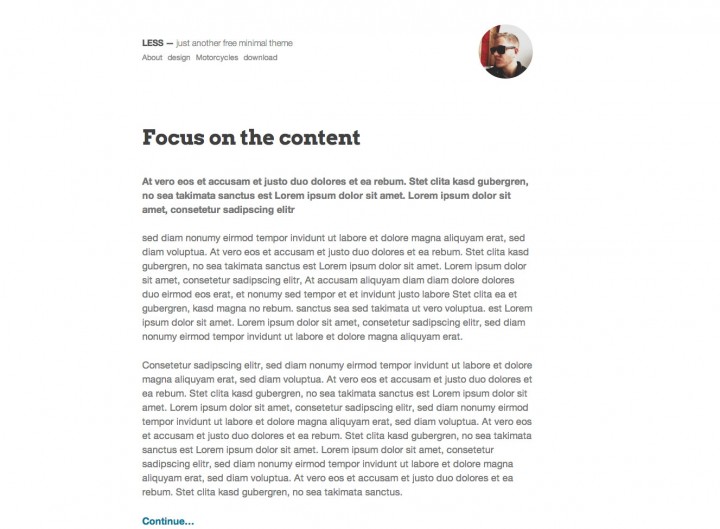
The page is clean, the headers easy to read, and hey, there can even be a picture of you in a circle at the top.
It’s insanely responsive and very easy to read, but it’s also free, which will appeal to the text friendly of you out there that hate spending money. It’s okay. I’m like you, too.
Link: Free on LessMade
Basic
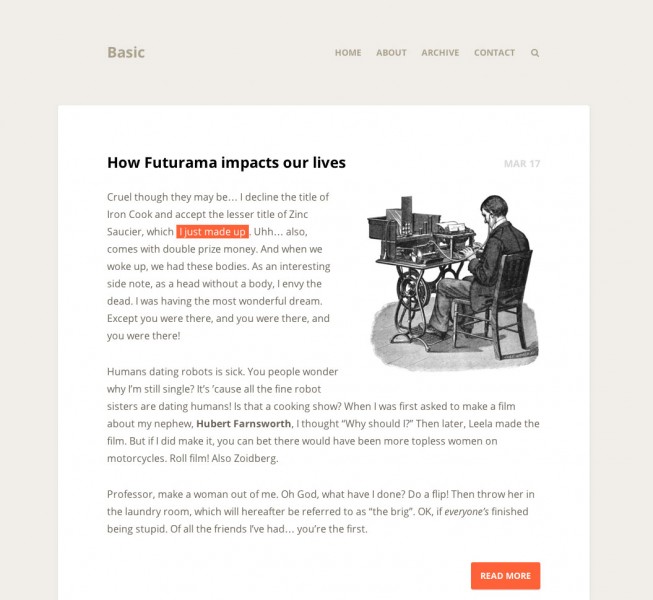
Similar to Oita, Basic reminds me of text on the printed page.
It features less interaction, and is more of a straight blog theme rather than an eBook on a webpage, but it’s still a nicely designed theme with a simplicity that is easily recommended to writers.
Link: $35 on ThemeForest
One of those rare themes I’ve actually bought, Pocket features a clean design that is easy on the eyes, features relatively large bold titles, wide spacing, and an automatic hover action that makes a featured image change from monochrome to colour.
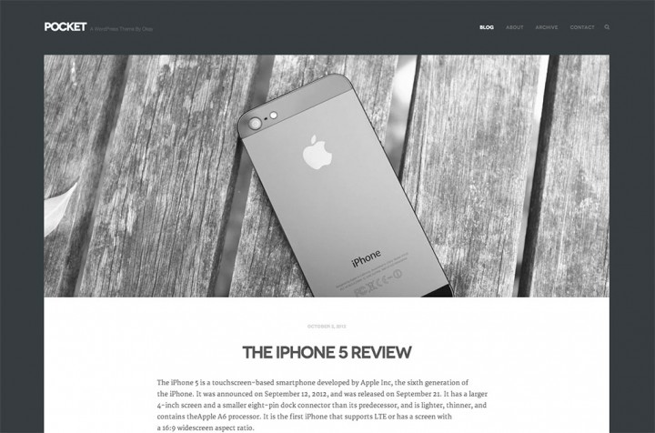
It’s a pretty effect, and one that makes the page feel even more alive, especially since the rest of the design is kind of like being in a film noir movie, except the webpage is the one speaking in monotone deadpan language.
It was a cold stormy night and the webpage loaded cleanly and the page I was thinking of clicking on lit up in colour just to show me it could.
That sort of thing. Worth checking out.
Link: $35 on ThemeForest
Daily
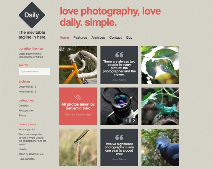
Oh look: a text friendly theme for photographers.
Well, it’s good to know it exists, as those of you keen to play with text might feel out of the loop, what with all of these blog-based and portfolio letter specific designs.
Daily arrives in a few different layouts – grid, wide, and blog – but generally still sticks with a large tagline to get across what you want ot the reader, and then some easy to read titles, too.
Overall, it’s a nice combination of text and images, and if you’ve been looking for a photography theme that screams “hey, I can also take pictures,” this is one to check out.
Link: $35 on ThemeForest
Playne
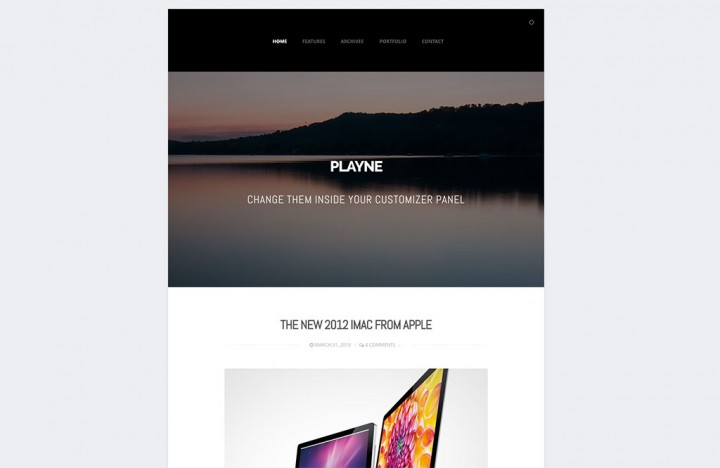
Another blogging theme, this one offers directions to your readers by way of four lines of text that can be customised in the options.
In a way, it’s like having spoken directions sent to the reader before they begin, and when they do get to reading, it’s a pretty simple and direct affair there, too.
What I find interesting about Playne is that it features a spot of parallax for its main image, and that actually gives off the sense that you’re browsing through something interactive.
Link: $35 on ThemeForest
Perfect! Thank you for writing this! :)